little
letters
club
the backstory
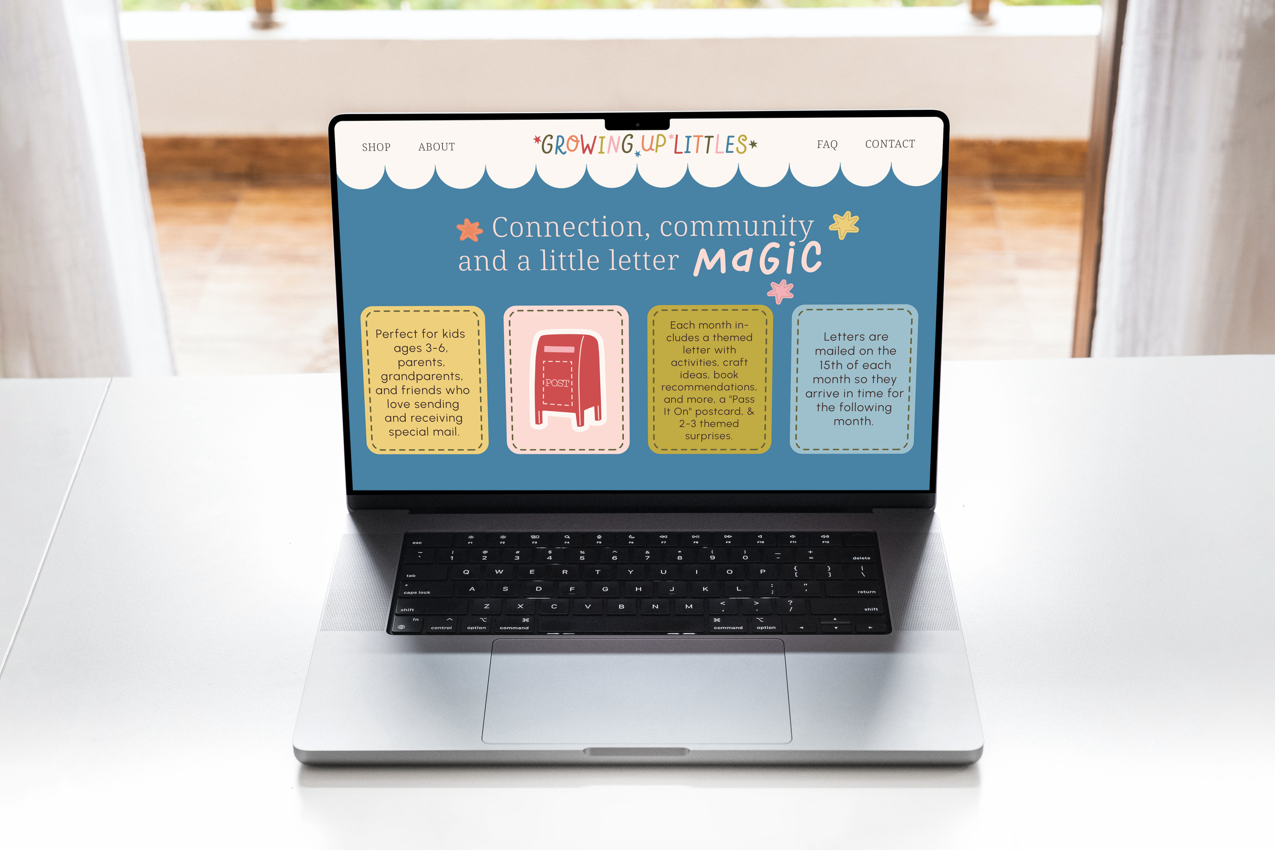
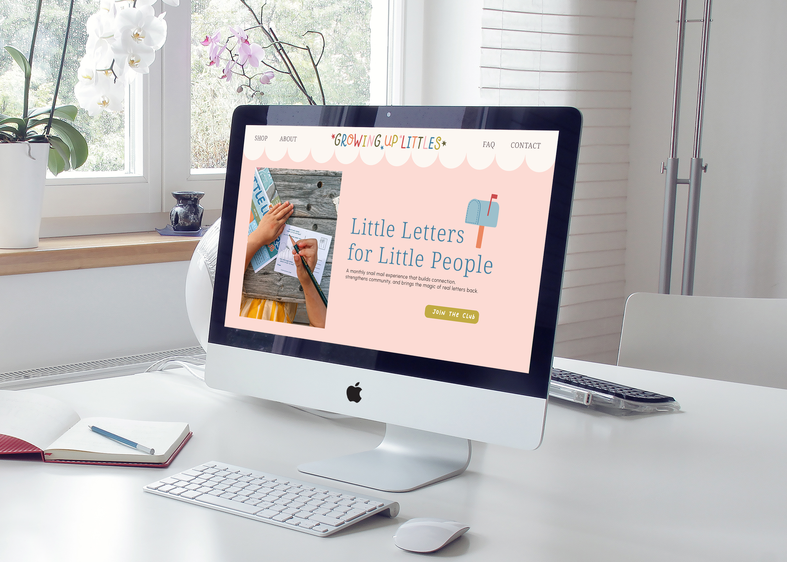
Kendall came to me because her business was quickly growing. Little Letters Club, part of her wider business Growing Up Littles, is a monthly letter subscription bringing back the magic of receiving mail into childhood. But her brand hadn't caught up to what she'd built. It looked cute, but it didn't yet look like the keepsake-worthy experience she fully envisioned.
the logos
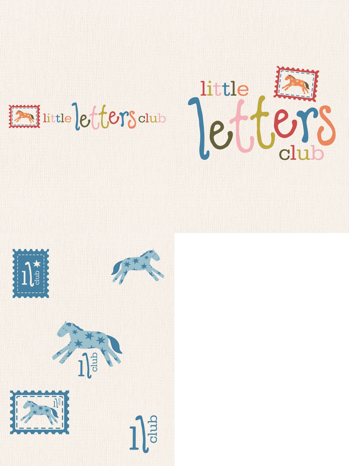
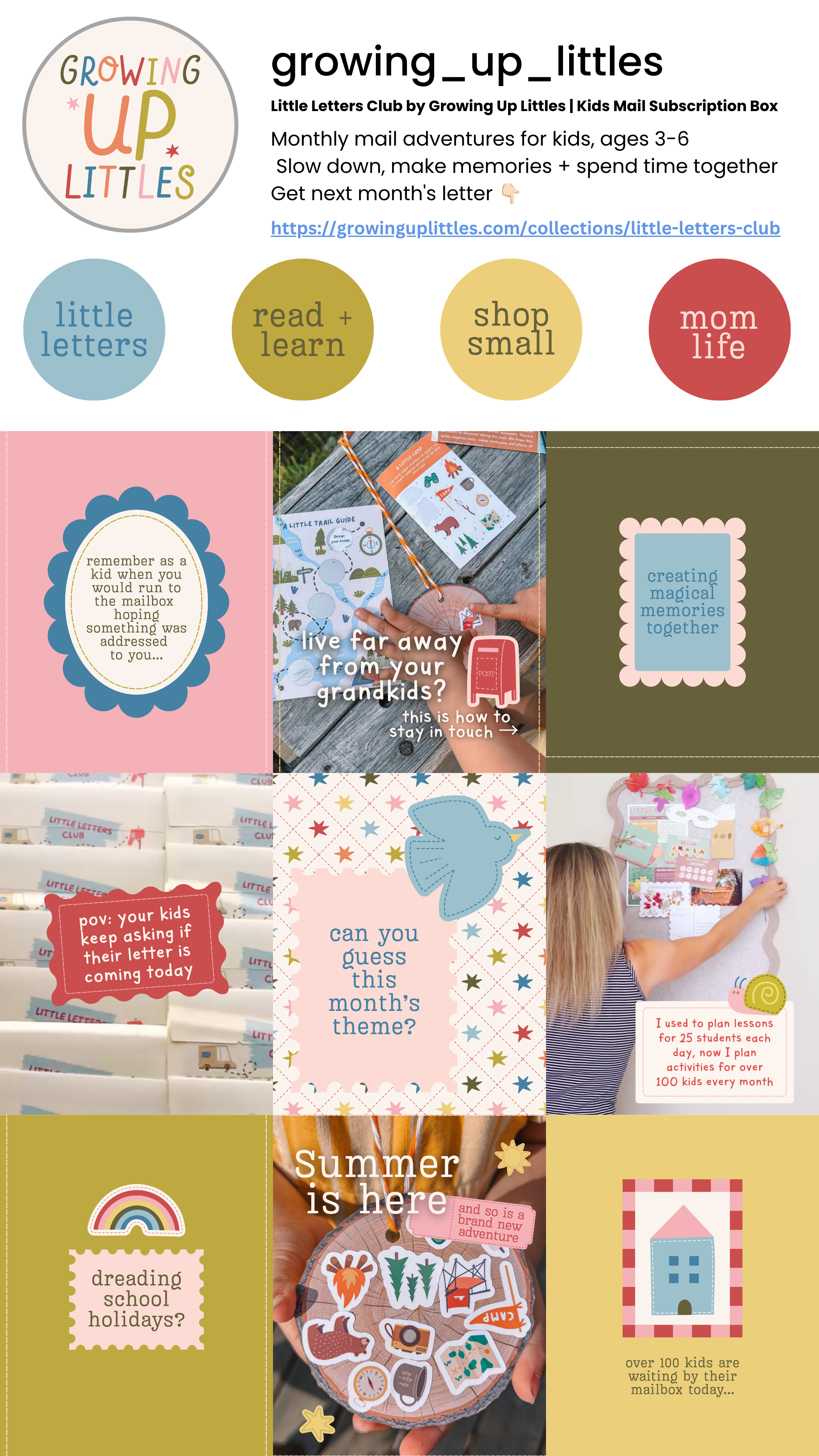
The vibe for Little Letters Club was built on "vintage keepsake" nostalgia, dusty blues and red, mossy green and blush pinks, paired with a hand lettered logo and stitched, sticker-style illustrations of stars and everyday childhood charm. Designed to feel like something worth holding onto, not just opening and tossing aside, it brings back the slow, connected magic of childhood for the kids receiving it and the parents and grandparents sending it.
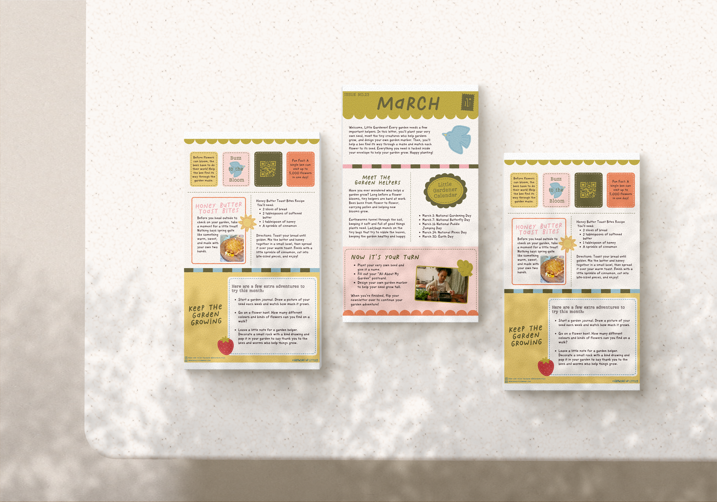
the palette
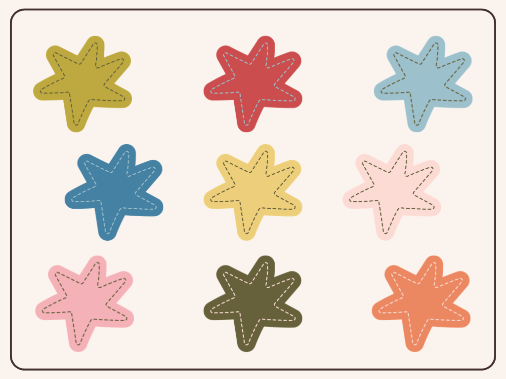
the brand breakdown
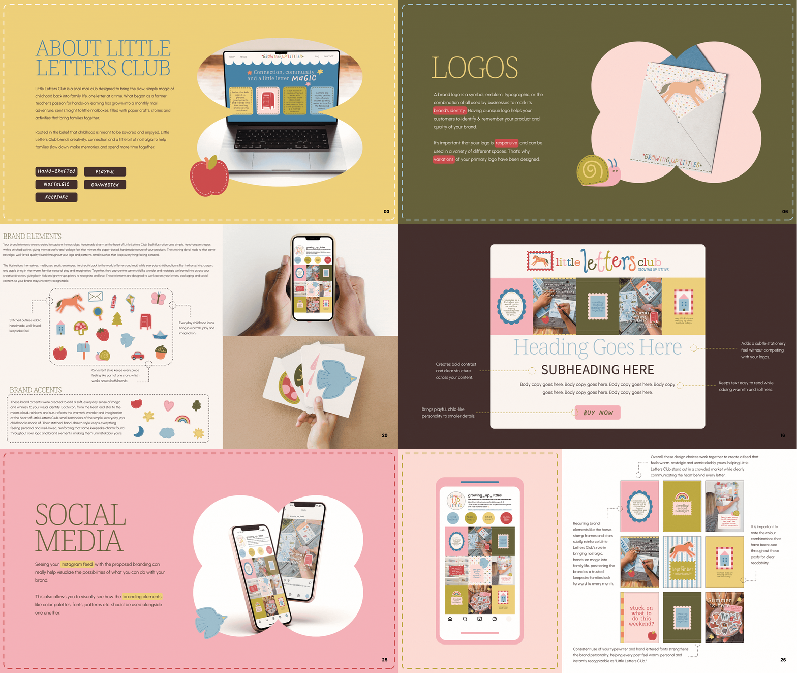
“She somehow took my jumble and mess of the ideas I had in my head for my business and created the brand of my dreams! I felt like someone finally understood what I was trying to create with Little Letters, and turned it into something I'm so proud to show people.”
the socials
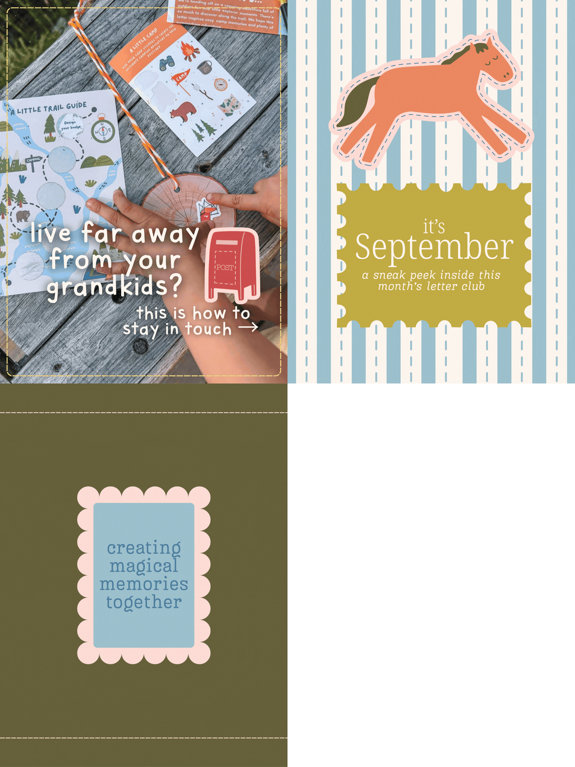
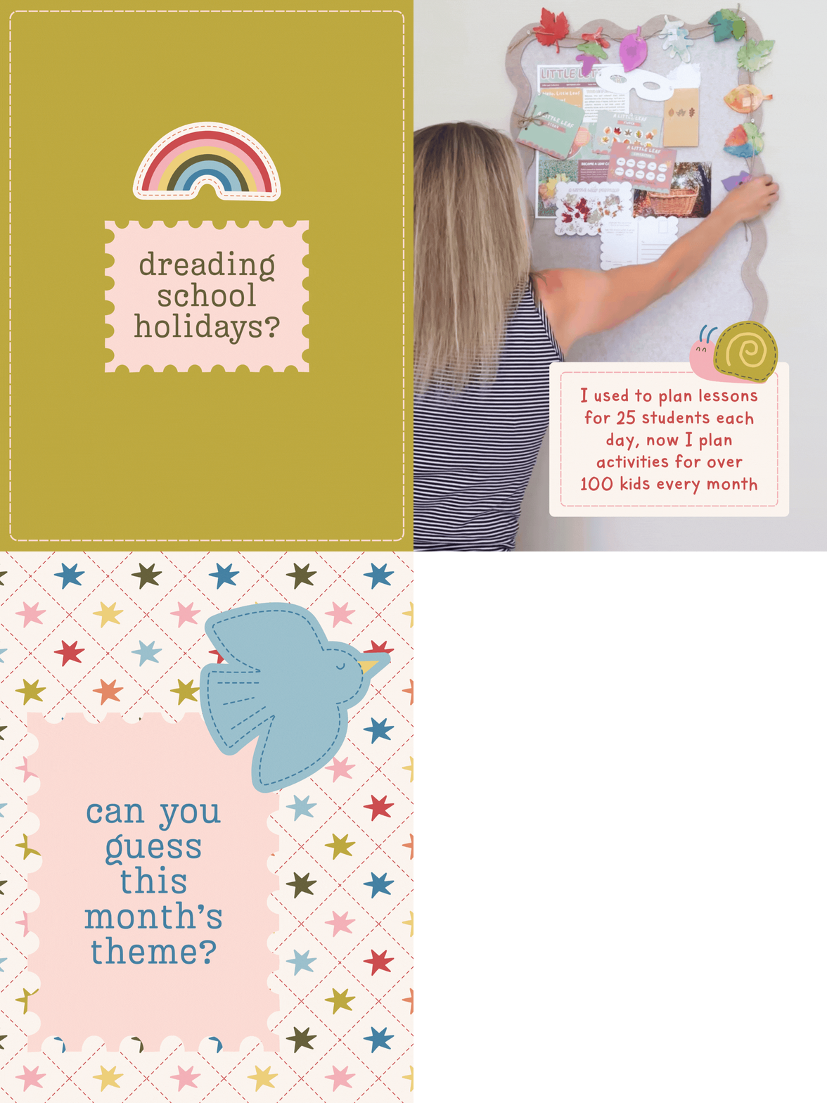
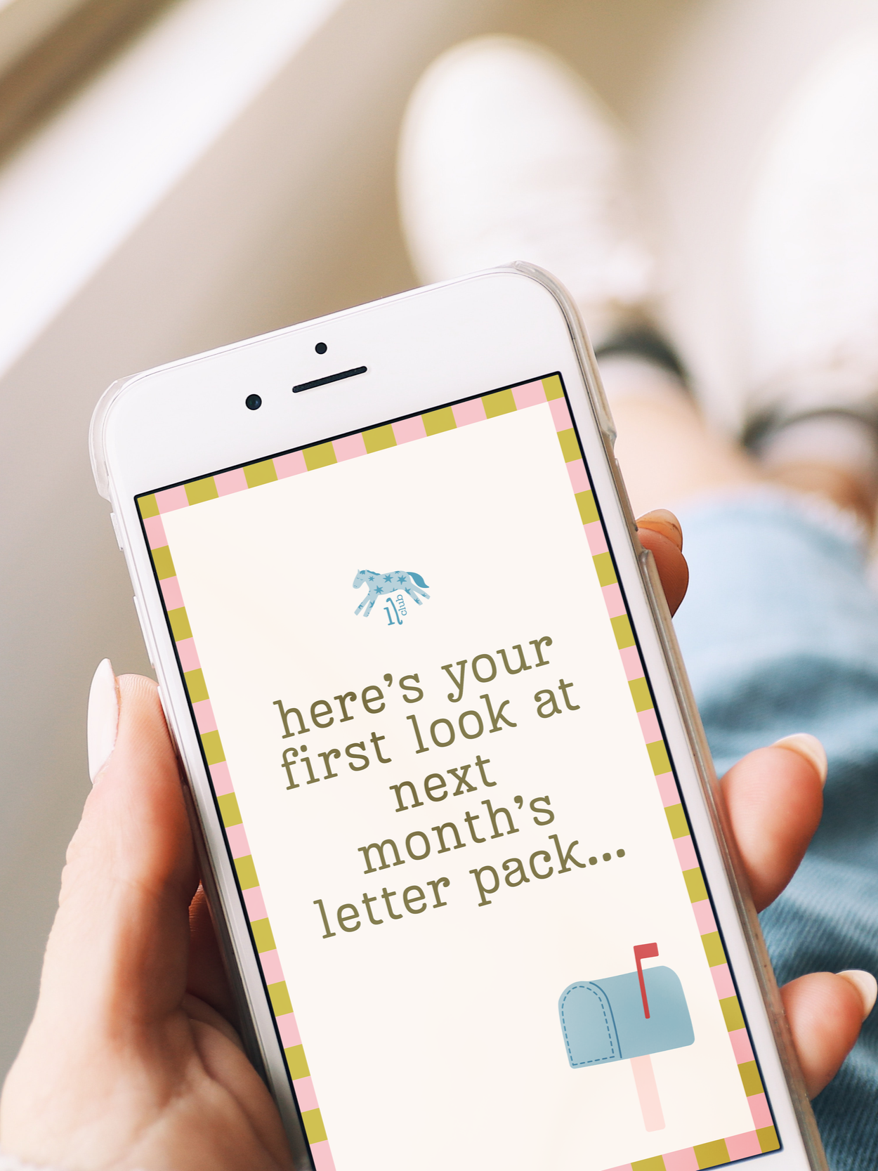
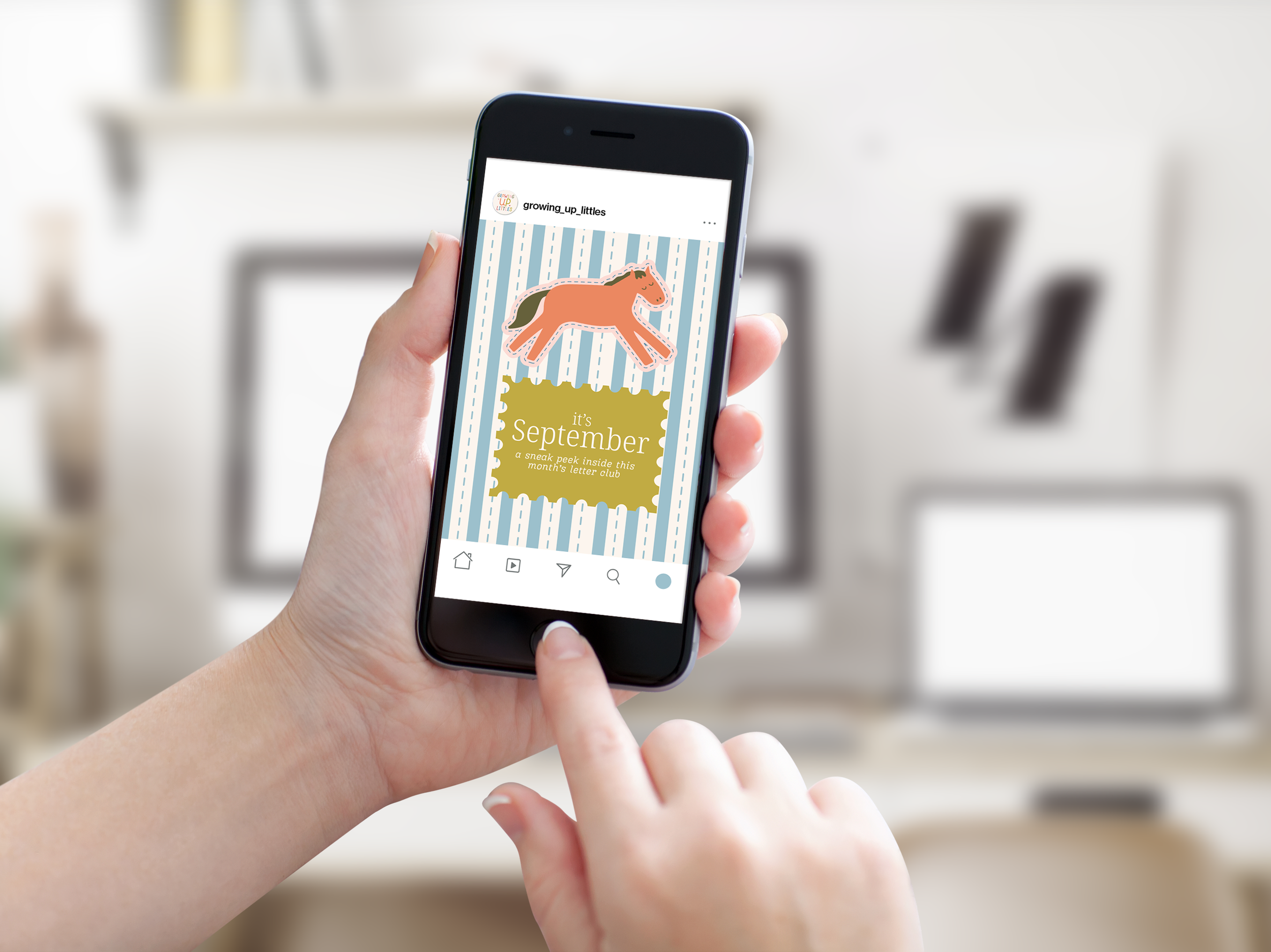
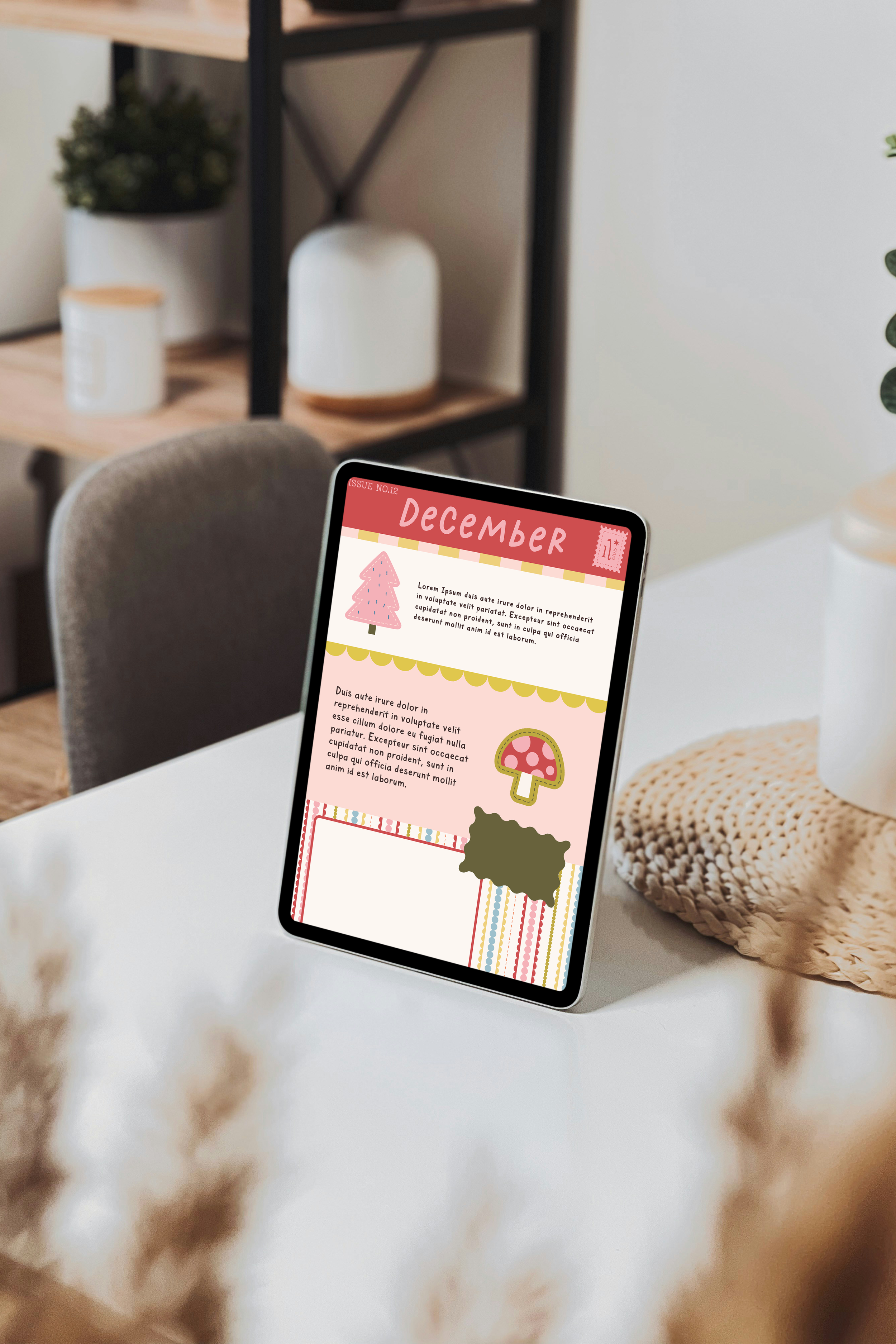
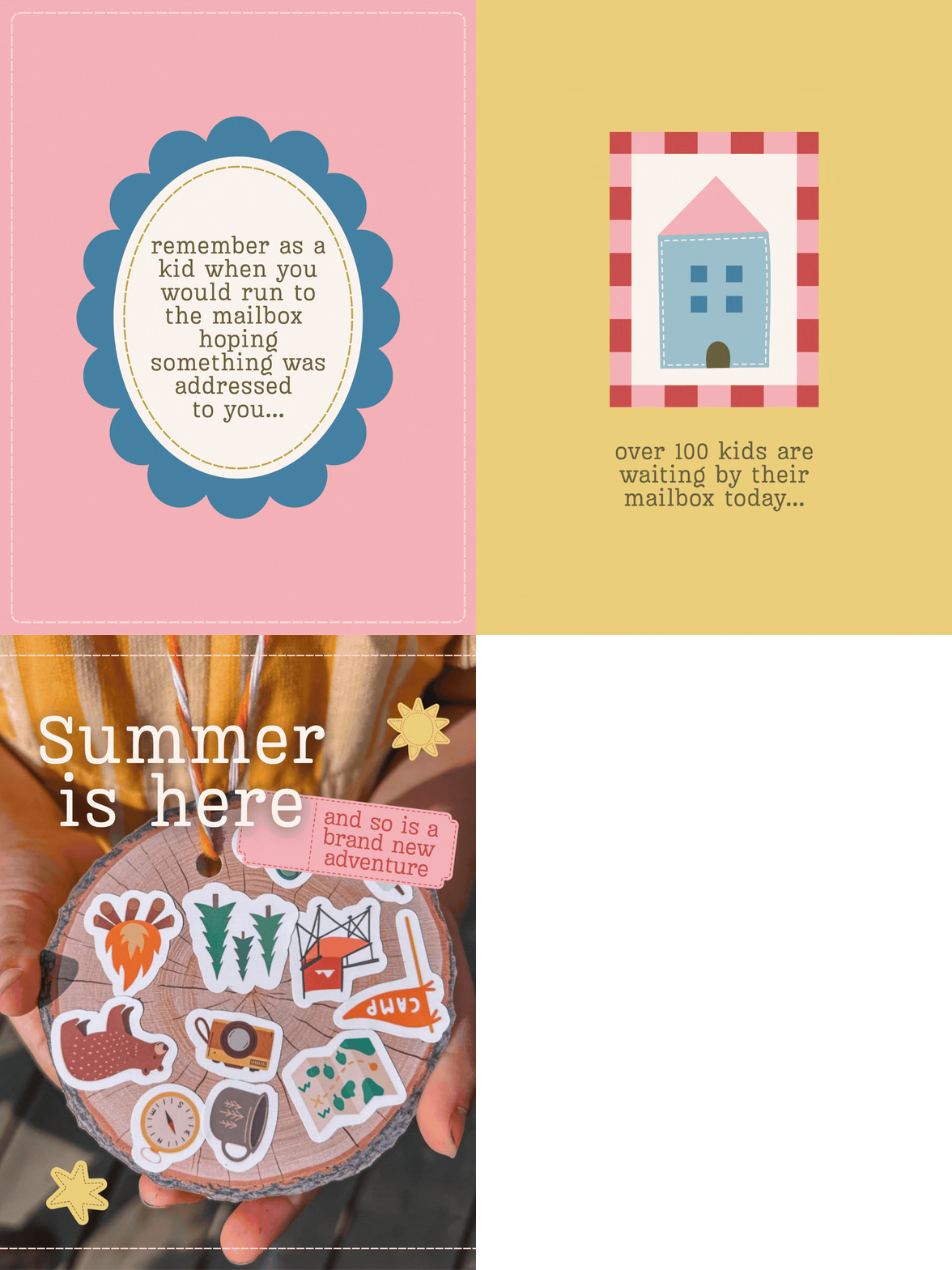
We brought that same magic to every detail of her brand, from her social media templates to her monthly newsletters, including those small illustrated touches that make each piece feel like a keepsake. Now her whole brand finally looks like the magic she's been building all along; playful, warm, and unmistakably hers.